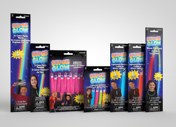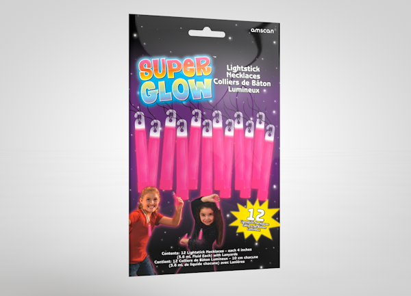
Before Super Glow™, Amscan’s glow offerings were sourced from multiple vendors with entirely disparate packaging. Each product looked like it came from a different company — because it did. There was no shelf coherence, no brand story, and no way to planogram a section that made sense to a buyer or a customer.
Consolidating Amscan’s fragmented glow line meant building an identity from nothing, designing a package for every item, and delivering a Style Guide their teams could maintain after launch.
I created the Super Glow™ brand and product architecture. Two constraints shaped the design system: shelf impact at a distance, and modular package sizing that would let retailers planogram entire store sections cleanly. The line ran to nearly 50 glow items — each with its own package design — with custom-photographed kids and prominent product imagery that communicated clearly to the parent who was usually holding the wallet.
Beyond the base line, I created seasonal variants — Halloween, 4th of July, New Year’s — and program-specific packaging for different channels and audiences. The brand architecture held across all of it.
The Style Guide became Amscan’s internal reference for everything after launch: color systems, typography, photography direction, and package architecture. The brand was built to be handed off.
- Client
- OmniGlow, LLC. for Amscan, Inc.
- Category
- Identity & Flexible Packaging